Your Homepage Has 7s. Here's What It Should Be Doing.
Your homepage has seven seconds to earn a visitor's attention — here's how to make them count.
Your Homepage Has 7s. Here's What It Should Be Doing.
There's a strange contradiction at the heart of most business websites. The people who built them spent weeks debating colour palettes, hero images, and which testimonial to feature. The people visiting them spent about seven seconds deciding whether to stay.
That gap is where deals are lost. Not on the contact form, not on the pricing page, but in those first few seconds when a stranger arrives, glances around, and either leans in or leaves. If you want your website to actually generate business, the homepage has to do real work in that window. Here's what that work looks like.
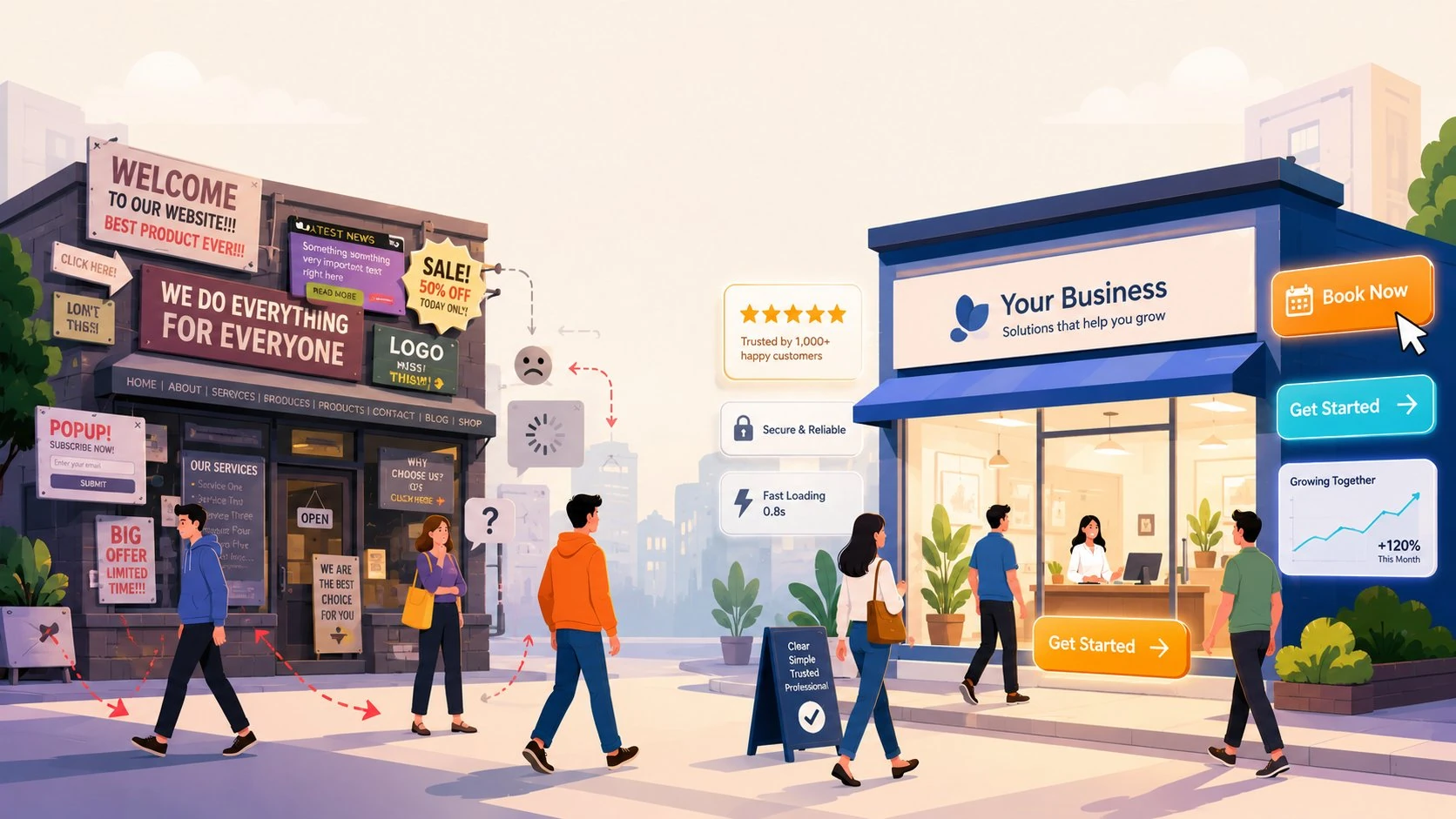
Tell Them Where They've Landed Within One Sentence
The single most common failure on B2B and B2C homepages is vagueness. Visitors land on a hero section full of words like "empowering," "innovative," and "transforming," and walk away with no idea what the company actually does. If a friend of yours had to describe your business after looking at your homepage for five seconds, could they?
The fix is a clear, specific headline that says what you do and who you do it for. Not what you aspire to be. Not your mission. What you sell. A logistics platform for mid-market manufacturers. Handmade leather bags shipped from Florence. Tax software for freelance creatives in the UK. Specificity beats cleverness every time, because clarity earns the right to be clever later.
Show, Don't Just Tell
Once a visitor knows what you do, they want proof you can do it. This is where most sites fumble by relying on stock photography and abstract illustrations. A photograph of a smiling woman in a headset wearing a blazer tells me nothing about whether your software works.
What does work: screenshots of the actual product, photographs of the actual team, before-and-after examples, named client logos, short video clips of the thing in motion. B2C buyers want to see the dress on a real person. B2B buyers want to see the dashboard with real data. Both groups are trying to imagine themselves using what you sell, and your job is to make that imagination as effortless as possible.
Anchor Trust Above the Fold
Trust signals shouldn't be tucked into a footer or hidden three scrolls down. Whether it's recognisable client logos, a star rating from a review platform, a count of customers served, or a brief quote from someone whose name and title carry weight, this evidence belongs near the top of the page. Visitors are constantly running a background calculation: is this real? are these people credible? would I be embarrassed to buy from them? Answer those questions early and the rest of the page does its job more easily.
A note on testimonials: vague praise from anonymous initials reads as fabricated, even when it isn't. A specific quote from a named person at a recognisable company is worth ten generic five-star reviews.
Make the Next Step Obvious
Every homepage needs one primary action you want visitors to take. Book a demo. Start a free trial. Shop the collection. Get a quote. One. Not seven competing buttons in different colours all shouting for attention.
This is harder than it sounds, because internal stakeholders all want their pet feature represented on the homepage. The marketing director wants the newsletter signup, the CEO wants the press mentions, the head of recruiting wants the careers link. Restraint here is genuinely valuable. A homepage with a single, well-placed call to action will outperform a homepage with five, every time.
Speed Is a Design Decision
Here's something that gets overlooked in conversations about website design: performance is part of the aesthetic. A slow site feels cheap regardless of how beautiful it is. If your hero image takes four seconds to load, half your visitors are already gone before they see it.
This matters more now than it used to. Mobile traffic dominates for most consumer businesses, and mobile users are unforgiving. Image compression, lazy loading, and a build that doesn't ship megabytes of unused JavaScript aren't technical luxuries — they're the difference between a homepage that converts and one that doesn't.
The Test That Actually Matters
Forget what your team thinks of the homepage. Forget what your designer thinks. Show it to someone outside your industry for ten seconds, take it away, and ask them three questions: What does this company do? Who is it for? What would you do next if you were interested?
If they can't answer all three confidently, the homepage isn't finished. It doesn't matter how polished the typography is or how on-brand the colours are. The job of a homepage is to communicate clearly and move people forward, and everything else is in service of that.
Most websites fail not because they look bad, but because they're built to please the people who commissioned them rather than the people who visit them. Flip that priority, and the seven seconds start working in your favour.
Want a homepage that actually pulls its weight? That's what we do. Get in touch and let's talk about what your site could be doing for you.